
The living room, as the name suggests, brings life to the whole home. It is one of the spaces where guests are received. It is where homeowners spend their time sitting around, unwinding, and exchanging conversations.
Living rooms reflect the character and preferences of the homeowner. It’s one of the spaces in the house where family pictures are displayed, personal collections like books, ornaments, paintings, and other home accessories that people treasure very dearly.
With that being said, the living room is considered one of the most important rooms to decorate in your house because it conveys your family, traditions, and your overall personal style. To inspire you, we gathered the best colors to paint your living room!

1. Crisp White
[PIN id=”70720656638017227″ description=”hide” size=”large”]
[/PIN]
Crisp white is simple, timeless, and matches everything! You can bring an entire color palette of furniture and decorations and consider this color your blank canvas to indulge your unlimited creativity.
[PIN id=”14918242507116830″ description=”hide” size=”large”]
[/PIN]
Just like this photo above that has white walls with a sudden burst of colors in the furniture. The color itself enhances natural light so it makes the area breathable and spacious no matter what scale. You can never go wrong, or even out of style with this.
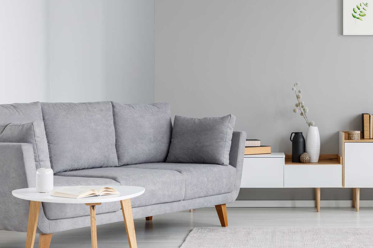
2. Light Gray
[PIN id=”114419646774444879″ description=”hide” size=”large”]
[/PIN]
If you’re the type of person who is a geek for artwork and a fan of coffee tables or unique pieces of furniture, this is your color because it enhances their textures. Light gray coordinates well with other neutral colors so it’s a must-try when you want a calm room with dynamic textures.
This aged gray acrylic paint from Rust-Oleum has an ultra-matte and velvet texture for finishing and can be used on a variety of surfaces from metal, wood, and canvas to achieve a vintage look.

![]()
Click here to see Rust-Oleum’s ligh gray paint on Amazon.
3. Very Peri
[PIN id=”128282289377366515″ description=”hide” size=”large”]
[/PIN]
What better way to paint your living room but the official color for the year 2022? Very Peri encompasses a unique combination of periwinkle blue and violet-red undertones. Very Peri color is laid back and stylish. With this, you get the best of both worlds!
4. Pistachio
[PIN id=”412783122097867654″ description=”hide” size=”large”]
[/PIN]
This photo above balances the combination of brown, white, and pistachio. This color makes your living room look gallant and soothing because it harmonizes the natural energy present in the area. This color also blends well with white, black, brown, orange, and peach.
5. Black
[PIN id=”1407443623872997″ description=”hide” size=”large”]
[/PIN]
According to Feng Shui, black portrays the water element that equates to wisdom, stillness, and deep contemplation. Black is the perfect color to bring timeless elegance and portray power to your home. It provides the room with more space and intensifies available light.
[PIN id=”443956475772112266″ description=”hide” size=”large”]
[/PIN]
If you’re a fan of minimalism, black is your color. Take for example this photo above that intensifies black walls and furniture that sets a dark and clean mood. Black can also bring a manly appeal to your home. It is best for modern and classic living room settings.
6. Crimson Red
[PIN id=”569072102923158500″ description=”hide” size=”large”]
[/PIN]
Crimson red invokes a stunning charm to your living room. It is a bold and vibrant color that adds a daring expression to the area. The color is striking yet very comforting and best fits any contemporary or country-style living room setting.
7. Terracotta
[PIN id=”39758409199873632″ description=”hide” size=”large”]
[/PIN]
Terracotta adds an aesthetically refreshing look to your living room. It can also match various prints and enhance its texture like the photo inspiration above. It’s great to also pair it with neutral colors like deep brown and white gray for a cozy and collected vibe.
[PIN id=”26458716554701514″ description=”hide” size=”large”]
[/PIN]
Incorporating terracotta with plants gives the space a very earthy tone. If you’re a fan of shabby-chic or rustic themes, this is the perfect color for that look!
8. Amethyst
[PIN id=”259660734756600956″ description=”hide” size=”large”]
[/PIN]
The amethyst color hue can vary from lavender to deep color. This color portrays tranquility and refinement. Adding this color to your living room can brighten up the area while promoting visual calmness to your mind and body.
9. Pale Blue
[PIN id=”9499849204579401″ description=”hide” size=”large”]
[/PIN]
Pale blue is the perfect definition of heavenly feels. Since the color is light, it optimizes the sunlight in the area in a very calming and breathable way. This color is serene so you’ll definitely feel like relaxing in a haven above the sky.
10. Marigold
[PIN id=”506092076886493643″ description=”hide” size=”large”]
[/PIN]
Marigold is a brilliant color for the living room. Take for example this photo above that gives the area a very tantalizing and very welcoming attraction. This is also suitable for patterns that complement the sudden pop of bright yellowish color.
11. Navy Blue
[PIN id=”1046312925897905039″ description=”hide” size=”large”]
[/PIN]
Navy Blue is a color for royalty. It has a dashing characteristic that makes the area feel inviting and eloquent. It can best be combined with white and gold furniture. It also compliments mustard yellow or teal to complement its deep hue.
12. Muted Pink
[PIN id=”808185095609462264″ description=”hide” size=”large”]
[/PIN]
Muted pink is best for both traditional and contemporary style settings. It adds a light, feminine touch to your living room and also creates more space for indoor lighting like this photo above.
13. Coral Pink
[PIN id=”540150549102191385″ description=”hide” size=”large”]
[/PIN]
Coral Pink is the perfect color if you want to go very vibrant in your living space. This photo above shows how coral pink complements beige, red, and even emphasizes the texture of paintings and ornaments.
This color paint from MicroBlend is a great product to get started with your coral pink living room peg. It has a silky, shiny, and luxurious finishing to make your walls look fresh.
![]()

![]()
See MicroBlend’s coral pink wall paint on Amazon.
14. Beige
[PIN id=”296463587962420707″ description=”hide” size=”large”]
[/PIN]
Parallel to the colors white and black, beige is also a classic color for your living. It can also match any hue, especially brown, blue, emerald, or red. It makes rooms look larger, airy, and warm. This is also the perfect color for rustic-styled rooms and can match any modern and traditional furniture.
15. Lime Green
[PIN id=”14284923808325232″ description=”hide” size=”large”]
[/PIN]
If you want a splash of life into your home without adding decorative indoor plants, Lime Green is the color you should opt for. The color looks natural and adds freshness to your home, making a friendly and bright color statement.
Some Important Things To Consider
Choosing a color for your living room is exciting and it’s a very fulfilling responsibility. But, remember that it’s not just all about colors. It’s smart to be equipped with knowledge as well. Here’s a list of a few challenging things you’ll need to consider.
Color Scheme
Generally, the color scheme serves as the expression of the overall design of the space both visually and psychologically. Colors have the capacity to set the whole mood of the room, accentuating the size, lighting, furnishings, and even a person’s energy levels.
The first thing to always remember about your living room’s color scheme is to always match colors that will result in a pleasing combination. You must firmly decide what mood you want to set in your room, and then find colors that will perfectly suit that mood.
Furniture
The nature of furniture is that it functions to serve a purpose but despite that, it still speaks about personal style.
It’s important that your furniture should match your living room color to balance visual weight. Make sure that the furniture complements the decor and colors. One great tip to remember, stick to one living room theme if need be.
Lighting
If the living room has lower light, its color can appear less intense and dark. If the room has a higher amount of light, the color becomes bright or even comes to its natural state.
Too much light can cause the color to look saturated and faded. So the right amount of light should be considered and this applies to all sources of light in the room like bulbs, chandeliers, decorative candles, and most importantly, windows.
Living Room Scale
This is the most fundamental factor to consider before coloring the area. If you want a small space to look big, you should opt for light colors. On the other hand, a big space with too many colors can look like a carnival so it’s best to stick to one or two wall colors only.
Observe the scale of your living room so that you’ll know what type of decors to get, what size of furniture would fit, and most importantly, what color would enhance the whole area.
Do’s and Don’ts When Styling Living Rooms
Don’t!
- Don’t over-decorate with frames, books, or too much stuff.
- Don’t go over the top colorful, or don’t go too dull.
- Don’t buy a living room set. It lessens the oppurnity to creatively style the area.
Do!
- Do have enough seating for the living room for a conversation area.
- Do have a breathable space for movement.
- Do make use of side and console tables.
In Closing
Over and above all of that, go creative with your living room! Just remember to balance colors, textures, light, patterns, scale, and proportion and you’re good to go.